Question 1: How do your products use or challenge conventions and how do they represent social groups or issue?

For my magazine ,I did get inspired by fitness magazines.
However, I did challenge the conventions of it. For instance, typically,
fitness magazines have a lot of taglines, whereas mine did not have as much.
Reason being is because I didn't want to scare off people because me personally
I tend to see that whenever I read a fitness or just any magazine, that have a
lot of taglines. I kind of actually scares me away because it gives me the
impression that it has way too much information and sometimes you want to go
straight to a point.
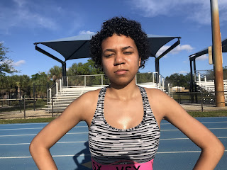
I also decided to follow a theme of just colorfulness
because I wanted to appeal to the public eye, especially since my pictures
aren't vivid and full of color. It's more like a natural setting in whatever
color was presented in that day, and the colors of the model of whatever she
was wearing. My masthead is located in the lower part of the my magazine and I.
The reason I did it in the lower part of the magazine of front page, instead of
doing the upright like how most masses are, is because my front page. I
actually wanted the audience to focus more on the model than the taglines,
because in my opinion it gives off the look of confidence, sexiness and hard
work. And that's exactly the message that I wanted to come across. And I also
did it red the masthead and in both because it is in the lower. I also stand
out and in this case, the name is beast. So that word itself, it doesn't have a
negative nor positive connotation if not it's neutral.
I wanted people to make their own meaning in their head. And
to me when I see the word beast is like a monster. But that's what I want
people to feel while they are working out. I also included a bar code in the
top right corner and bar codes relates to the price. So for the table content
page I use also colorful lettering. I used purple, orange and yellow. And the
reason behind it is because, like I said I wanted it to stand out. And
typically you don't see those colors together. And another way that I challenge
the convention of a magazine is because typically when you go to a
typical content page, you will see under that title you'll see like a little
paragraph. And I just stick with the title according to each page number. And
lastly, for my double spread page, I also kept it pretty simple. Kept it pretty
natural. And instead I just made a one quote that shaped the whole story
orange.
And the quote is placing gold and making sure to rest when
working now is extremely important. So the social group that I wanted to target
are those who are into fitness or those who are scared to start. I wanted it. I
wanted to do that because a lot of people, when they're very young, they're
they don't know where to start, how to start. So they get pretty intimidated to
go to a gym full of people that probably have years of experience.
I also like to target any age group. So because I didn't
want people to feel intimidated to start working out, I used a natural
background, which I part- because I want to give them a message that doesn't
matter where you are. All all that counts is where you start, how much effort
you put in. Not how much time, not how skinny how fat you are, just how much
effort you put in. So on.


Comments
Post a Comment