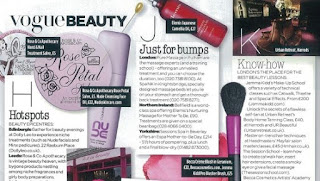
For each genre of magazine,I believe that there should be different colors.The colors on the genre will determine what gravitates towards the audience. As for fitness, colors that will catch people's eye red, orange, and yellow. Those colors represent fire, and when one works out they feel as if they are burning. The color red also represents boldness and fierce, for this reason,the title of my fitness magazine is BEAST in bold lettering with red and orange. I will also try and incorporate colors like hot pink and maybe green because of the brightness that shows through.

